For Software as a Service (SaaS) businesses like us, documentation is critical in ensuring customers can get the most out of our tools.
It provides an important safety net to help customers when they need it most, and it can give users added confidence when they start to use a new product or service. Some customers will have little experience using the product or service, whilst others may want to use very specific features – and may need some guidance to do so.
Documentation plays a crucial role in both scenarios and can often be the difference between success and failure for many businesses. But unfortunately, many businesses treat documentation as an afterthought, and we want to challenge that.
So, in this article, we’ll share how we improved our documentation with the help of K15t’s incredible Scroll Viewport for Confluence product with the goal of helping you elevate your company’s customer-facing documentation.
Our Challenge: Rapid growth can put a strain on existing processes
After being founded in 2017, our portfolio of products (apps) and the team around them grew rapidly. Numerous internal teams were working together across different products, and we soon noticed our approach towards documentation had become disjointed and no longer fit for purpose.
Something needed to change.
We were managing all our documentation on Confluence, which worked well for us initially. As we scaled, however, we started to run into a number of problems:
- Draft documentation was visible: Each of our products had its own Confluence space for documentation, but there was no way for us to separate draft and published content. Sure, page restrictions could have been used, but this would have been a manual process and one prone to human error. On top of that, if we wanted to use inline comments to provide feedback on documentation, these were visible to everyone – customers included.
- Styling was inconsistent: Confluence has limited styling options, so our documentation felt disconnected from our brand and ultimately lacked personality and appeal.
- It was difficult to search for information: if customers were to search for information on our Confluence site, it would typically display results from across all our products rather than the specific app they were using.
- Documentation was not part of our web domain: Our Confluence domain was hosted on http://atlassian.net. This didn’t impact customers, but from a web traffic perspective, it felt like a real disconnect not to have a high-traffic domain attached to our core website.
- Release notes were buried: Our team puts a lot of effort into releasing improvements and new features that make a difference to our customers. Unfortunately, our release notes were a set of child pages within each product documentation space. This meant they were effectively buried despite our best attempts to make them more visible.
Don’t get us wrong, we’re HUGE Atlassian fans, and Confluence has been an incredible tool for helping us manage our documentation internally and externally.
But, as we grew, we reached a stage where we needed to adjust our approach to documentation.
Our criteria for a new documentation solution
Confluence was definitely the right tool for us, and since we already had all of our documentation stored there, we wanted to avoid a complete upheaval. Our ultimate goal was to find a better way to provide customers with high-quality, well-structured, consistent documentation.
After a few discussions internally about the “must-haves” versus the “nice to haves”, our search began…
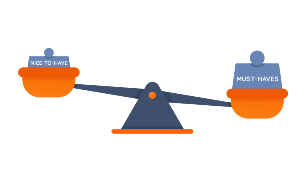
During our search, we were looking for a tool that would meet these requirements:
- Integrated with Confluence: As avid Atlassian users and advocates, moving away from Confluence was not an option.
- Separate draft and published content: This would provide us with the flexibility to review content thoroughly without customers seeing draft versions.
- Well-structured and easy to navigate: We wanted customers to get the answers they needed simply and swiftly.
- Intuitive to use: Time is precious, so the tool needed to be quick and easy for our team to get to grips with.
- Reliable: The core benefit of product documentation is that it is always available. Our customers are based around the world, so we needed a solution that would be available 24/7 and with minimal downtime (if any at all).
The Solution: Scroll Viewport for Confluence Cloud
We quickly identified Scroll Viewport as the right fit for us and spoke with the folks at K15t about trying it out.
Over two years later and we have not looked back since.
Scroll Viewport has been the cornerstone of our product documentation ever since, and, like thousands of fellow companies, we’re very happy customers!
It’s the documentation solution that exceeded all our expectations
AppFox has been using Scroll Viewport since early 2021, and we’re proud to have been one of the first Atlassian Marketplace Partners to adopt the Cloud version of this awesome tool.
“Scroll Viewport has transformed the way we present our documentation to customers and partners alike. Our documentation is now branded in line with our guidelines and is easy for people to navigate and find the information they are looking for.”
Emma Thomas, Head of Product at AppFox
Over the past few years, we have noticed more and more Atlassian Marketplace Partners using Scroll Viewport to house their documentation, and this is great to see for two reasons;
- More customers will benefit from product documentation being made available in the awesome Scroll Viewport tool
- Because we feel like trendsetters (and that’s pretty cool for a small team 😉)
The Results: How Scroll Viewport has made a difference to AppFox
So why do we love Scroll Viewport so much?
Honestly, there are a ton of things we could rave about for this product, but we’ll narrow it down to the top seven that have made the biggest difference for us.
1. Branded/styled help center
It’s important to be consistent at every touchpoint for customers and branding plays a key role in achieving this. If the look and feel of our documentation were wildly different from every other resource for AppFox, it would soon stand out – and not in a good way.
Luckily, one of the core features of Scroll Viewport is that you can brand your help center to align with the visuals of your organization. It allows you to add custom banner images and logos, change the color palette throughout using Hex codes, and even do some custom CSS styling.
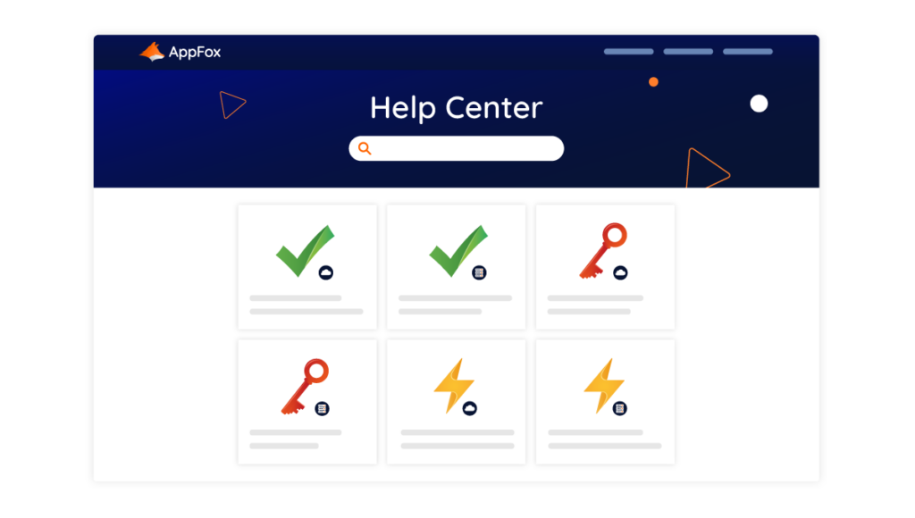
If you want to transform your Confluence documentation into a beautiful, branded help center, look no further!
2. Simple to use
Life is far too short to deal with overly complex tools that need encyclopedia-sized manuals to set up or use.
Scroll Viewport definitely is NOT that type of product.
It’s highly intuitive to use, and we found, from the first moment, that we managed to use most of the functionality without looking at the documentation (oh, the irony!).
But it’s not all about us. Most importantly, our Help Center is now really easy for our customers to use and it allows people to find the information they are looking when they need it.
3. Easy to navigate
This one is closely linked to the point above but deserves its own mention.
With Scroll Viewport, you have options for how you want to display your documentation. Are you after a list-style format or more of a tiled approach?
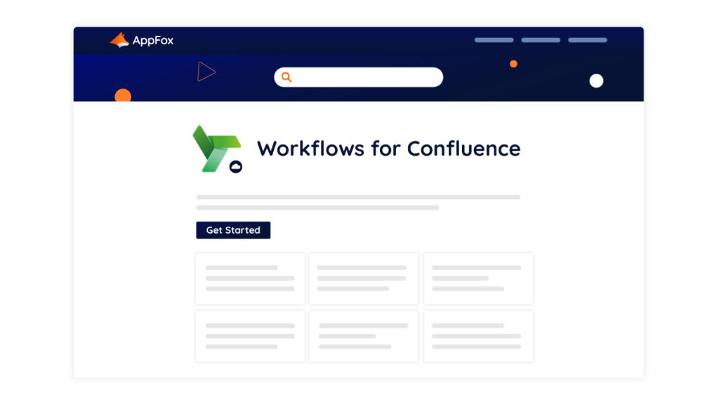
As you can see, we went for the tiled approach, but both are clear and simple to navigate for customers. The goal is for customers to be able to find information quickly and easily, and we think Scroll Viewport certainly delivers on this.
4. Integrated, contextual search
One of the biggest benefits of using Scroll Viewport is the integrated, contextual search. Our customers can click on one of our products (e.g. Optimizer for Jira), and if they then use search, it will only return results for documentation within this section.
This might seem like a niche benefit to you, but it makes a huge difference to our customers.
It allows them to get the answers they need about the product they are interested in. It cuts out all the noise from the other documentation pages and makes the process of finding information a lot smoother for them.
5. Integrated with Google Analytics, Tag Manager and Search Console
This one does not directly impact the customer experience, but it gives us great insights into our most popular content and any areas that need improvement.
As mentioned at the start of this article, documentation is a key part of ensuring customers have a good experience with your product. So, tools that analyze what customers are looking for – and where improvements can be made – are like gold dust to any company that wants to continue on a path of success.
Scroll Viewport comes with a number of integration options with the Google Analytics suite, and it’s super easy to set up and begin benefitting from those insights.
6. Frequent improvements
After using Scroll Viewport for a few years now, we’ve been blown away by the amount of updates that have happened over the years. It’s pretty clear the team at K15t is focused on making this product even better, and we have seen some awesome changes released.
The most notable was the synchronization speed update that was released a little while ago. This honestly blew us away 🤯
Before this update was released, it would take a little while to re-sync our documentation, but after the update arrived, it only took a few minutes to sync hundreds of pages, which is amazing!
It might sound a little odd that we’re so excited about loading speeds, but it made a HUGE difference to our team’s efficiency and overall experience. If this was the result for us as a small team, we can only imagine the impact of this change for a larger enterprise using Scroll Viewport.
7. The gift of top-quality support
In the world of software, there is no perfect product or service – and that’s okay!
What makes a real difference is knowing that you will be supported when you run into a problem or issue, and K15 has smashed it out of the park with their customer care. Each time we’ve interacted with their team, from our very first conversation with them, we have felt supported, and everything has always been dealt with in a timely manner.
Scroll Viewport has been extremely reliable for us over the past few years – in fact, we have only run into one minor issue since beginning to work with them, which was swiftly resolved by the K15t team.
It’s so easy to take this for granted, but there are countless examples in the world of poor service that we should not ignore when a team consistently goes above and beyond.
If great support is important to you, based on our experience working with the team at K15t, you will not be disappointed!
Bonus Integration: Elevating our documentation process by combining Scroll Viewport with Workflows for Confluence 🧡
On occasion, two apps work magically together. This has been the case with Scroll Viewport and Workflows for Confluence.
When we started using Scroll Viewport back in early 2021, we were already using our Workflows for Confluence product to help manage our documentation internally. We used it to set up custom workflows and an approval process that enabled the right experts on our team to review content before it went live.
Once we started using Scroll Viewport, this process was elevated further.
Today, we are creating our documentation internally in Confluence. Using Workflows for Confluence to get content reviewed by the right team members, and then once it’s ready, Scroll Viewport will transform this content into pages on our beautiful help center.
I think that calls for a chef’s kiss 🤌
Conclusion: Scroll Viewport has transformed our documentation for the better
For many companies, documentation may not always make it to the top of the list in terms of importance. But we know it plays a critical role in helping customers get the most out of the product and having a good experience, and for us, that’s worth its weight in gold.
Scroll Viewport has completely transformed how we manage our documentation, enabling us to provide high-quality content that users can easily navigate.
It has also simplified the process of creating and managing documentation, eliminating the fragmented approach from years ago and allowing our team to focus their attention on the work that matters most to customers.
There are a wide range of examples of companies using Scroll Viewport to transform their documentation, and you could be one of them in the future!
You can get a free 30-day trial of Scroll Viewport for Confluence via the Atlassian Marketplace, so be sure to check it out!
